Goal
Design a logo concept around the idea of dental occlusion (the way our teeth fit together). The logo must be flexible enough to identify three sets of products and services offered by a single organization.
Solution
Beautiful teeth are not the only goal of dentistry; form must be integrated with function. Our teeth exert tremendous force when we chew, and each tooth's surface must be carefully shaped to ensure that it aligns perfectly with other teeth. Any imbalance can result in chronic pain, so creating just the right fit, using just the right materials, is critical for both health and aesthetics. This dental practice specializes in occlusion, and this focus provides the inspiration for the logo concept.
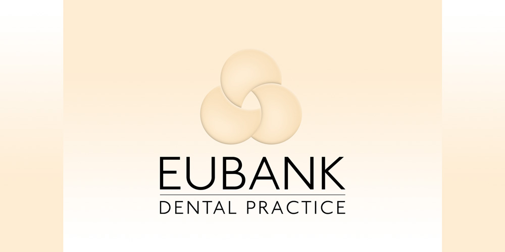
The umbrella organization provides three different services for two different markets. Each service adds value to the others. Just as the three service offerings stem from a single philosophy, three crescent shapes come together to form a single icon – they fit together perfectly. The icon’s dimensional quality is reminiscent of the smooth, rounded surfaces of teeth.
Each of the services needs its own set of marketing materials, so each offering is designated by a specific color, all sharing the dentist's well-known name with the addition of a department underneath.
Colors were chosen to appeal to the two audiences. Dentists receive materials using deep blue and olive: blue for the continuing education programs and olive for the custom-made appliances manufactured by the on-site laboratory. Materials for the dental practice audience include a light flesh tone that defines the practice separately from the dental community but maintains the same primary message. When needed, materials created to represent the full organization (the "Group") use rich black weighted toward cool hues.
Each logo is enhanced with subtle gradients and thin lines, evoking the precision and meticulous attention to detail that have won this practice a national reputation.

