The Seed From Which It Grows: A Logo Contains The DNA Of A Brand
Entrepreneurs must master communication skills. We can't read one another's minds, so images and words are the only way to tell people about your offering and create the desire that transforms strangers into customers. Your website, advertising, product packaging, logo and brand identity are the chief means of establishing an image in the minds of customers, and these are the only tools you have to create value in the mind.
But the modern landscape is crowded with communications. To develop your customer base — to be heard through the noise — your message must be clear and distinct. As you build your business, your ability to communicate will create the primary motivation for customers to engage with your offering, so understanding how to develop compelling, unique communications has become the best way to differentiate your business from the competition.
This process usually begins with a logo. A well-designed logo is a distillation of everything a company represents. It visually describes the offering — the vision, the personality and the purpose of your brand. A great logo can become as identifiable as a flag or a road sign. It can associate your offerings with price or quality or status or a particular emotion. When done well, a logo can elevate a brand, giving fans a symbol to rally behind.
CHANGING THE AGREEMENT OF LANGUAGE
Three circles, a straight line and a bent line do not, by themselves, communicate anything. But if I put these elements together in a particular order I can communicate the idea of a friendly, furry animal that millions of people think of as a member of the family. Put together in a slightly different fashion, these same elements conjure the idea of an all powerful deity. These simple shapes work together to create a visual metaphor. A word is not the thing itself — it is only a stand-in. Language only works because we agree that it does — we all choose to agree that the word “dog” stands for our canine companions.
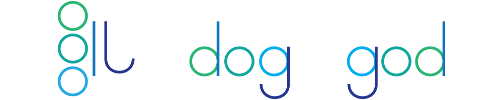
When you create a logo you are creating a word and supplying the meaning behind that word. You have an unlimited number of elements available to you — shapes and colors and letters that can be combined in unlimited ways to supply information about your offering and create an impression of value. You are, in effect, creating a new word.
A recent example is the word "dell." A few years ago, it just meant "a small valley." The only time you ever heard it was when small children sang "The Farmer in the Dell." Today, of course, most people associate the word with one of the world's largest technology companies. The word has a new meaning. "Coke" is no longer associated with coal. We tend to think of shoes instead of ancient Greek gods when we hear the word "Nike."
CREATING NEW ICONS
Human beings have infused symbols with profound meaning. Crosses, hearts and dollar signs convey complex concepts in simple, easily identifiable shapes. You can do the same for your company.
Nike, Twitter and the Olympic Games have created instantly recognizable icons that mean the same thing in any language. Corporate logos convey personality, value and some idea of the company's primary offering. Twitter’s blue bird “tweets” — a reference to the short messages that form the core feature of the communications platform. The Olympic rings graphically represent the five continents using colors that are found in the flag of every nation. Nike’s “swoosh” conveys a sense of speed, references the golden sandals of the winged goddess of victory, and resembles a stylized piece of footwear. These simple devices encapsulate emotions and meanings into an easily recognizable shape. When done correctly, a logo can transmit paragraphs of information in a half-second glance.
YOU CREATE THE MEANING
It's not enough to create a word — you must also create the meaning behind it. If I take some letters and throw them together they have no meaning. I could say “TSFHOG” and leave you wondering if I’ve forgotten how to speak. But if I tell you that TSFHOG means “too smart for her own good” the acronym suddenly makes sense. Entrepreneurs must not only develop the word, they must also provide the meaning behind it. Xerox, Audi, Pepsi, Chanel — these words only mean something because entrepreneurs have worked hard to associate them with specific offerings.
Let's take the example of "dog" once again. We can, with a few simple shapes — circles, curved lines, triangles — create a clear idea of “dog.” There’s no need for further explanation; if you saw this icon in a foreign land you would understand that something nearby serves the needs of dog owners. If you saw it at the entrance to a park you would assume the park was for dogs. If you saw it above the door to a store you would assume that the store offered pet products.
A logo blends the familiar with the unfamiliar; it must be new, yet it depends on shared cultural references that already exist. The entrepreneur is responsible for using the tools provided by language and history to guide the viewer to an understandable yet innovative conclusion.
THE VALUE OF SLOGANS
For many companies, the addition of a slogan helps clarify the meaning of the logo. Nike uses the slogan "Just Do It.” They aren't telling their customers to get off the couch and buy shoes — although it wouldn't be too hard to cynically apply that meaning. Instead, the company is asking customers to think about their goals and reach for them; to achieve their own definitions of victory. The slogan adds another layer of depth, and creates a compelling message that resonates with customers, inspiring them to reach further and work harder. The slogan of the modern Olympic Games, “Faster, Higher, Stronger,” clearly defines what the games provide — an opportunity to push human abilities ever further and learn what we are capable of. Since its introduction in 1894, Olympic athletes have done precisely this, setting new records and achieving feats once believed impossible.
The words and symbols created by logo artists have become another part of our language. Done well, they can contain a wealth of meaning, and provide a flag for us to follow. Whether for a political candidate, a non-profit organization, a social movement or a for-profit company, a logo can become the symbol on which we hang everything we know, hope and believe about a brand.
Function Fashions Form: Three Things You Must Do Before You Create A Logo
Ideas can be complex and difficult to communicate. Language can be insufficient. A blank piece of paper poses a difficult challenge. So how do you create a logo — a set of letters and symbols — that encapsulates everything a company stands for?
STEP ONE: CHOOSE THE MEANING
The idea behind a dog icon is fairly simple. It doesn't take a great leap of imagination to understand how this icon relates to the real world and what people want. But this can be much more difficult when an organization is based on an abstract idea or offers complex products and services. How do we create a logo for a company that offers thousands of different items? How do we create a logo that describes serving the needs of the poor? Developing these types of logos is much more difficult.
Once a logo has been created it becomes exactly what a word is in our language — a visual container for meaning. After many years, you don't need to be told what the Coca-Cola logo represents. You don't need to ask what FedEx does. Through years of brand development and mental association, the average American understands how these companies can serve their needs.
This is why it is so important for entrepreneurs to execute a compelling visual identity for their company. Everything you do, everything you offer, and all the interactions that you have with your customers will be associated with that icon. When you start a new company you are building a tiny piece of language that's all your own; you have the opportunity to create a word and its meaning. When this task is performed well, it becomes easier for your customers to remember who you are.
STEP TWO: DECIDE HOW YOU WANT TO CREATE THAT MEANING
Sometimes the meaning of a logo comes from its association to a place. The Eiffel Tower in Paris or Cinderella’s Castle at Disney World are easily identifiable and identify those places wherever they appear.
Meaning can also come from a person. Kentucky Fried Chicken uses Colonel Sanders in its logo and advertising, an homage to the man who founded the restaurant during the Great Depression. A little girl walking through the rain while holding an umbrella appears on every box of Morton Salt. She was developed to remind customers that Morton salt would not form clumps in humid weather. These characters add meaning to their respective logos — they tell a simple story that provides depth to the offering.
Logos can also be associated with time. The old Dr. Pepper logo contained three numbers — 10, 2 and 4 — to remind customers to take breaks during the day to drink soda. (Three cans totals 450 calories and 120 grams of sugar — probably not the best advice.) Time can also be conveyed through style; until 2012, Wendy’s employed a vintage look in its logo to reinforce the idea of “old-fashioned” hamburgers.
Of course, logos can also derive meaning from a thing. The panda referenced in the logo for the World Wide Fund for Nature clearly reminds people of the need to preserve the species. Apple uses an apple. Jaguar uses — you guessed it — a jaguar.
But many companies want to present meanings that are far more abstract, and these kinds of logos can be difficult to develop. Those meanings must be created using style or metaphor or context. These challenges can be met, but only if the company has clearly defined its offering, its mission and its audience.
STEP THREE: UNDERSTAND HOW THE LOGO WILL BE USED
You may offer the greatest product in history. You may provide the most sterling service. But without the logo, they won’t know that your company is behind it.
Using the logo well is one of the most important things you can do to create brand recognition. A logo is never just handed to a customer on a sheet of paper; it appears on trucks or billboards or the side of an airplane. It may be printed in tiny, almost invisible spaces. It may be embossed in plastic during the manufacture of a product or added to clothing. It can appear in vertical spaces or horizontal spaces or square spaces. Logo creators must understand all of the potential uses and applications for each mark, and design with the future in mind.
In terms of brand recognition, logo applications have a much higher return on investment than marketing — you can add a logo to almost anything for far less than you can produce and distribute an advertisement. In many cases, the logo will be seen far more often than any piece of marketing — just open your refrigerator to see this dynamic in action. Therefore, logo design is a vital first step in the marketing process. It pays to do it well.
The Parts Of A Logo: The Message
There are four elements in every logo concept: the message, the personality, the aesthetic, and the context.

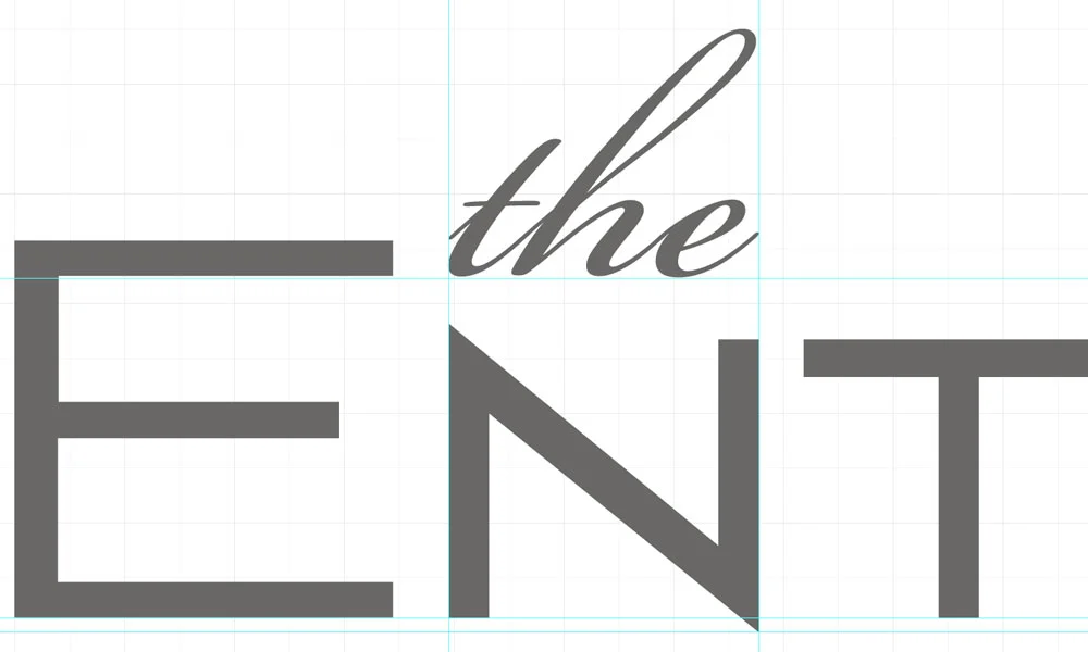
The designer's name is prominent, but the addition of a place adds a layer of meaning to the exquisitely designed typeface.
THE MESSAGE: WHAT WE SHOULD KNOW ABOUT YOUR COMPANY
A logo’s message is a blend of both the offering (the products and services offered by the company) and the vision of the brand. It indicates how your company is different from every other.
Let’s say you manufacture shoes for formal occasions. You may offer shoes in very low price points or you may offer some of the most expensive on the market. You may create custom footwear. Maybe your shoes are the most comfortable or the most fashionable or the most durable. Maybe they come from a visionary designer. The offering (shoes) and the vision (comfort or fashion or cost) combine to create a message that directs the creation of the logo.
A younger, bolder logo was developed to appeal to a different audience with a different product line.
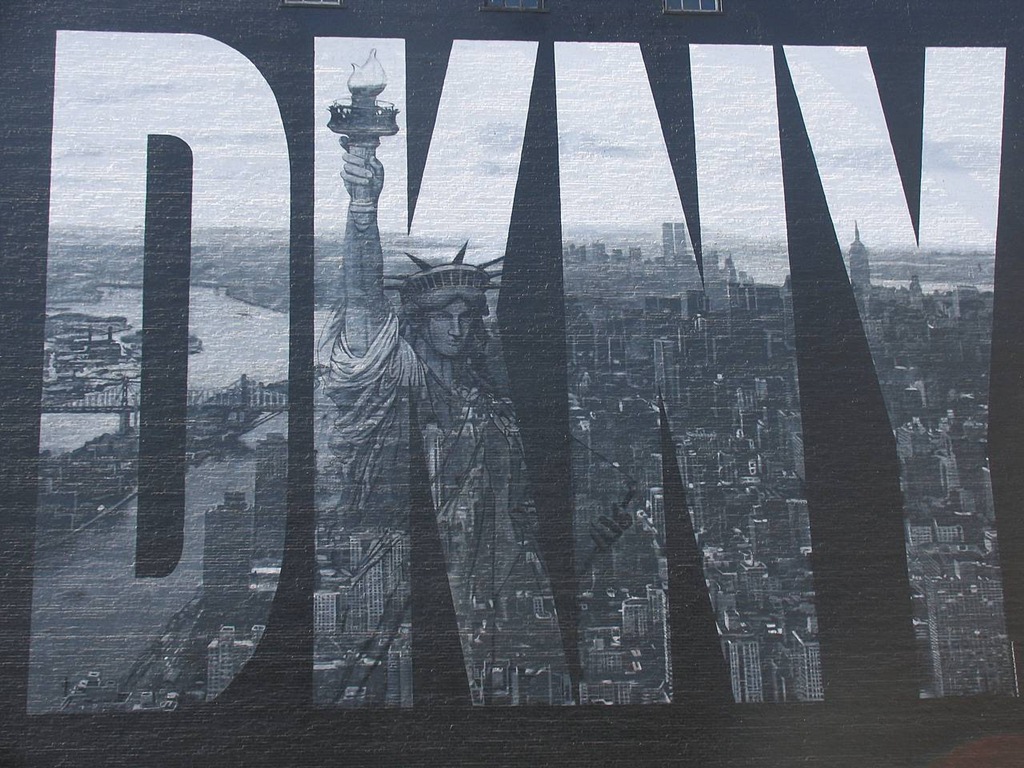
As an example, look to the fashion industry. A designer's name may carry the largest portion of the brand's weight. If so, it may be predominant. But that brand may want to produce several different offerings: a high-end couture line and a ready-to-wear line at a lower price point. One example of this dynamic is Donna Karan New York and DKNY. Both lines come from the same celebrated designer, but they appeal to different audiences.
A great logo offers the flexibility to create additional offerings over time. Other lines can be added, and the primary logo changed to reflect the addition. Donna Karan can create a cosmetics or jewelry line and add that word to the primary logo to indicate a shift in focus while retaining the power of the primary brand. This practice is called a brand extension.
Another company, Payless ShoeSource, focuses on cost, as reflected in the company name. This primary difference is reflected in the logo, which has a tagline that transforms the name of the company into a short sentence: "pay less for style." The message of the brand is clear, as is the company's market position.
CHOOSING THE RIGHT MESSAGE IS THE FIRST STEP

Does this logo look less expensive than the others? Typography and color convey the message of affordable value.
Of course, in order for the logo to include the message the organization must have developed a clear vision. In a time when we are inundated with calls for our attention and hundreds of similar companies compete for the same customers, the message has become the centerpiece of all communications. When very few businesses competed for attention, customers had little choice – they went to the business that offered what they wanted. That’s no longer the case. Creating a clear, distinct message is a vital part of developing a modern brand.
Choosing the right message can be one of the most difficult yet critically important parts of the process. Many entrepreneurs aren't entirely sure how their company differs from every other, but a difference always exists. Creating a unique market position for your company can come from having a unique set of products and services. But most of the time, differentiation is the product of creativity. An approach to the offering can be as unique as the business owner.
If you’re not sure how your company differs from every other, consider:
- the owner’s personality
- personality traits in the primary customer base
- unique aspects of the offering
- innovative ways that the offering is delivered, manufactured or designed
- the company's location
- the history of the offering or product category
- affiliation with a group or demographic
- quality, safety and durability
- style
These are just a few of the many ways that your offering can be mentally separated from the offerings presented by your competition.
All of these aspects must be taken into consideration when a logo, slogan and company name are being developed. If a business wants to create an offering that's fun or useful or independent, that message must come through. If the organization creates an offering that is serious and formal and sophisticated, that must also be revealed. Form follows function; knowing what you want to say about your company is the first step in developing a way to convey that information.
The Parts Of A Logo: The Personality
There are four elements in every logo concept: the message, the personality, the aesthetic, and the context.
CLOTHES DON'T MAKE THE MAN, THEY SPEAK FOR HIM
When a man puts on a pair of baggy orange pants and a red rubber nose, he announces to the world that he's a clown. When he dons white tie and tails, he tells the world that he's going to a formal event. Jeans and a plaid flannel shirt may communicate an outdoor adventure or a hipster lifestyle. A business suit creates the impression of an executive. The same man may dress in many different styles, but the clothes do not change him. Clothes don't make the man, they speak for him — they communicate his personality, circumstances and intentions.
The same is true for your company. When you walk into a restaurant you can probably make a pretty accurate assumption about the cost of an average meal. You may also get a good idea about what kind of food is served — steaks, health food, Italian — all of these things are conveyed by the “clothes” the restaurant wears. When customers look at your website, see your ad on TV or take a package off the shelf to learn more about what's inside, they get a glimpse into the personality of your brand.
Personality conveyed entirely through type.
The personality of a company is a critical part of the logo concept and brand identity. A logo can be fun or serious, cute or formal. It can speak to the stability and longevity of a company or describe the kind of experience consumers can expect. When you develop a logo, understanding how to meld shapes, colors and words with existing social contexts to define personality is a critical part of the process. This is a unique form of creative alchemy: a good logo design is a distillation of the mission, offering and personality of a company.
But design must serve the concept it's intended to convey. Personality can be conveyed through instructions. When Nike says "just do it" they aren't suggesting that you just buy the shoes. They are, instead, suggesting that if you want to be athletic and energetic and fit, you should get off the couch and go do something physical. The logo for Slow Food includes a snail, an indication that we should both cook and consume our food with more mindfulness. In the case of Dunkin’ Donuts, the name itself is an instruction: take that doughnut and dunk it in some coffee.
Personality can be conveyed using the mission. The Whole Foods green leaf logo speaks to the idea of healthy food that comes directly from nature. The United Nations logo features all the continents on the planet surrounded by leaves from an olive tree — a visual representation of peace encircling the globe.
Personality can be conveyed by linking an organization to an archetype. Sports teams use this approach to develop visual personalities through their mascots. Animals of every type associate teams with the ideas of speed and strength and ferocity. Mythological creatures — a phoenix, centaur or griffin — can convey meaning, and many companies have used ancient gods as their standard-bearers.
The first step, of course, is choosing a personality that your company can wear comfortably. Each entrepreneur must decide how she wants her company to be understood by the public. She must choose a path that appeals to customers and feels appropriate to her. It can be a tricky thing, but when done correctly, the right corporate identity can create its own value.
The Parts Of A Logo: The Aesthetic
There are four elements in every logo concept: the message, the personality, the aesthetic, and the context.
The aesthetic conveys both message and personality. Therefore, aesthetic considerations shouldn’t be approached until the message and the personality have been clearly established.
SYMBOLS
Not every logo includes a symbol — the IBM and Dell logos do not include symbols, but the Microsoft and Apple logos do. When used, a symbol can create many layers of additional meaning while providing a design element that can be incorporated into a wide variety of applications. Over time, symbols can come to represent the company by themselves. The Nike swoosh and the Olympic rings are good examples. Symbols can also become great ways to introduce or maintain a logo concept in a wide variety of cultures and languages. For international companies, the symbol can become more effective at communicating corporate identity than the company name.
COLOR
Colors are chosen to convey familiar ideas. Bright, bold colors are suitable for cutting-edge, innovative companies. Earth tones might be used for companies that work with the environment. Fluorescent hues are used to convey a sense of fun for companies that serve younger demographics. Vintage color palettes can be used to create a sense of stability.
Color is an integral part of logo development because of common cultural associations with specific colors. You can't think of Halloween without orange and black, and Christmas will always be associated with red and green. As a result, you rarely find these color combinations used in logos unless they brand companies that sell merchandise for these holidays.
But color is much more then social and historical association. Subtle shades of colors can reproduce poorly. Color must be viewed in its print context — how it reproduces in cyan, magenta, yellow and black ink. It must also be evaluated for online use where it’s created from red, green and blue light.
Color combinations are also needed so that a logo looks good in many different contexts. Most companies create a clearly defined color palette that provides this flexibility. This color scheme may become irrevocably intertwined with the brand — Coca-Cola red, UPS brown and IBM blue are a few examples.
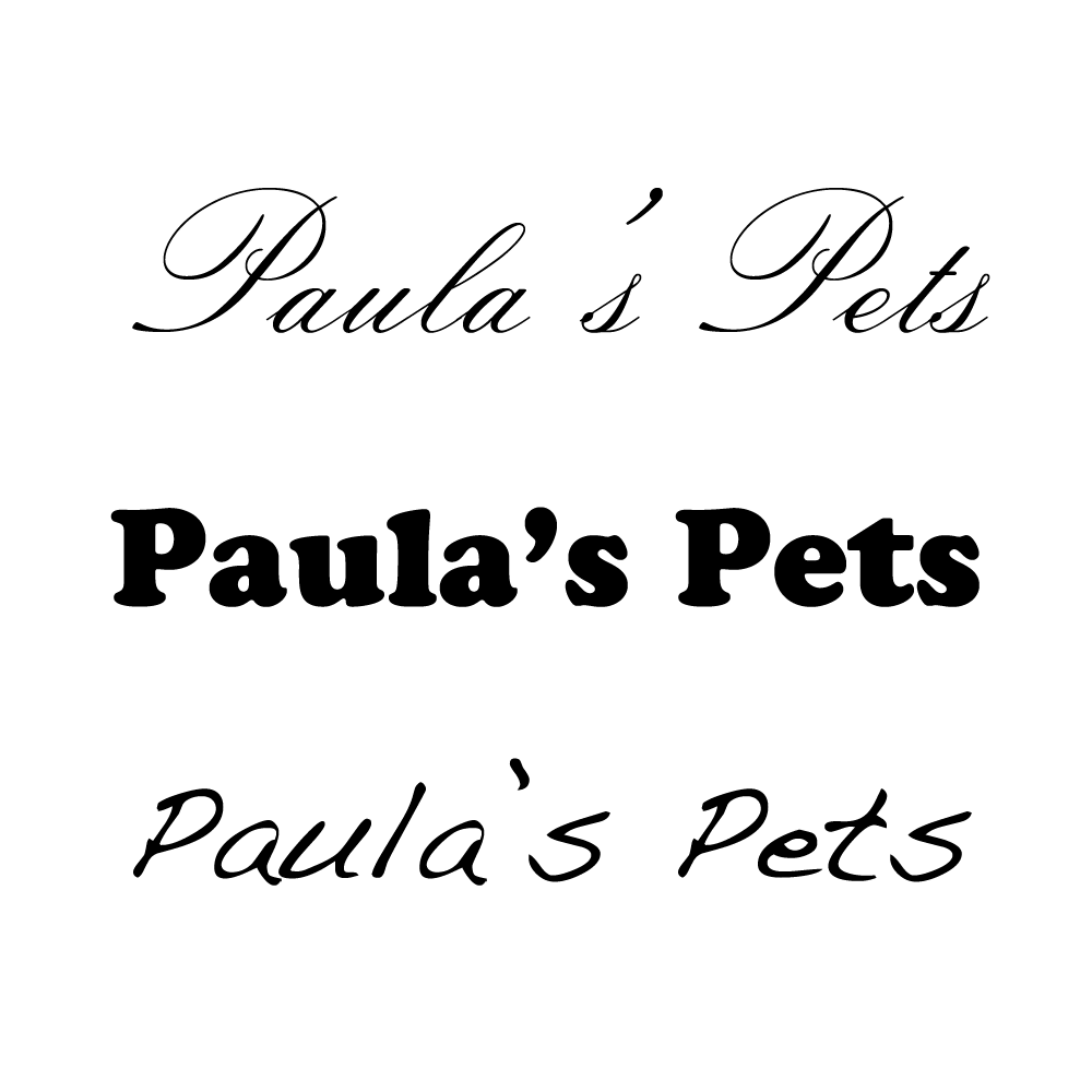
FONTS
Although we generally understand colors and social context — how we associate a color (red) with a particular thing (a heart) — many people don't realize that typography works the same way. Some typefaces are historical; some are futuristic. Typefaces can be formal or fun or powerful. The personality of the logo is conveyed as much by font choice as by color. (To clarify: typefaces are the broad families that include many different fonts. “Helvetica” is a typeface, “Helvetica Bold Italic” is a font.)
And, in the same way, font choice must be dictated by application. Some fonts will appear strange when enlarged beyond a certain size. Some become illegible at small sizes. The width and height of the letters must be evaluated, as well as the kerning (space between letters) and leading (space between lines of type). Since the chosen typeface may be used in a broad array of contexts, each letterform must be examined to make sure that it conforms to the overall impression of the brand. Fortunately, many gifted artists work to create new type for designers to employ.
For many logos, custom type is best. Your logo will be seen over and over by your customers, your employees and all those who might one day decide to learn more about your business. Working with a designer to create custom typography can set your logo apart from the rest and visually distinguish you from the competition.
STYLING
Shading can create a multi dimensional look. Shadows can make a logo pop. Outlining, underlining, swirls, textures — many different elements can be used to develop personality. Some logo programs are created with flexibility in mind, applying a predetermined style to different words or icons, creating a program that allows for a cohesive look applied to a wide variety of situations. Every modern Olympic games uses this approach, applying the theme to materials created for each sport.
Style is an integral part of the overall approach to logo creation. As you approach the project, keep in mind that building a logo program for a company is like buying a wardrobe of clothes for a single person. The company will find itself in many different situations and need clothes that are appropriate for each, but everything should fit well and maintain the unique aesthetic of the company that wears it.
The Parts Of A Logo: The Context
There are four elements in every logo concept: the message, the personality, the aesthetic, and the context.
SOCIAL CONTEXT
We instinctively understand the concept of beauty. We know what looks expensive. But watch a game show from the 50s or pick up an old magazine; the products that once looked expensive may appear cheap today. A woman's once fashionable hair and makeup might look ridiculous walking down a present-day street. Yet there is something that remains consistent through time; some portion of beauty that always looks the same. Good design works exactly the same way. It responds to current trends while remaining true to a deeper, more timeless aesthetic.
The visual cues that tell us what to think are also conveyed by our culture. Take the same designs and move them to another country and the meaning will be missed or — worse — misinterpreted. What can be seen here as serious and intentional could create, in another culture, an off-color joke.
Understanding the audience is a critical part of the logo designer's job. He must weigh the past with the present, and provide a design that lasts over many decades without becoming dated. He must be able to say "expensive" or "fun" or "cutting-edge" through a visual context that resonates across cultures and across time.
HISTORICAL CONTEXT
Logos must be developed within the context of the history of a market. Even a new company must understand the history of similar offerings and how they fit within the legacies already created by other organizations. Does that sector contain a great deal of history (soda, movies, cars) or, as with some new technologies, is it building a history all its own (smartphones, desktop computers)? Sometimes a new company can differentiate itself by responding to the histories that already exist.
Of course, cultural history is also a factor. Certain typefaces, styles and colors are going to recall particular historical periods no matter how they are used. Any logo that looks like it could be branded into wood is going to recall the old west. Balloon shaped letters remind us of the 60s. Understanding historical context is a critical part of the logo design process.
CORPORATE CONTEXT
Large companies occasionally refresh their logos. They try to take something that has existed for a long time and make it look new, hoping to reinvigorate the brand while appealing to another generation of customers. But these attempts are not always successful.
Logo designers must appreciate and incorporate history. But the design must also recognize where the company wants to go. Companies are always changing, taking on new ventures and reaching into new markets. Logos must be flexible enough to accommodate these potential transformations. Within the discussion of the past, present and future of an organization, one of the most important things to understand is that the promise of a logo is fulfilled over time.
Every word you read is just an assembly of letters — the meaning is supplied by all of the people that share your language. In the same way, a logo is just an icon; the meaning behind that icon will come from the company that uses it and the people that engage it. Every product, every customer, and every relationship will add its own weight to the meaning it conveys. Decades of history can change how we think and feel about a logo. Corporate history is filled with examples of companies whose once stellar reputations were tarnished by events, changing the meaning of the brand forever. While designers may create a visual metaphor, it is the company itself that will create the thoughts and feelings that customers associate with it.
From Concept To Completion: Executing The Logo
Logos are everywhere. They are hung on the sides of buildings, pressed into plastic products, sewn into clothing and emblazoned on the tails of airplanes. The designer must present the logo in a wide range of permutations to anticipate an almost unlimited number of uses. When working with a designer, make sure that she provides the final product in all of the categories below.
COLOR CONSIDERATIONS
Black and White (no grey)
Every logo must be designed in black and white with no shades of gray — a “1-bit” execution. A logo that cannot be executed in this manner is unfinished. Many designers start with the black-and-white logo, rather than take a full color logo and reduce it to this form, because it is much easier to add color and shading than to reduce a complex design. Although it may seem simple, this format is critically important. If a logo fails to convey the intended message in black and white, it fails altogether.
This type of logo is often used in product manufacturing and on promotional items which cannot incorporate shading or color variation. A 1-bit logo can be embroidered on fabric, etched on glass and metal, diecut from paper, and pressed into or printed from plastic. As 3D printing becomes more commonplace, this variation of the logo will be used more frequently.
Greyscale
Greyscale logos — 8-bit logos offering 256 shades of a single color — are used in any applications where only one color of ink is available but shading is possible. One of the most common uses is desktop laser printers which print using black toner but can reproduce shading. Greyscale logos are commonly seen in the black-only pages of newspapers.
Don't think of this format as black — a greyscale logo can be printed in any color. When materials need to be printed in only one color, usually to save money, a "spot" color can be used. Spot colors are single colors of ink; an almost unlimited number of choices are available.
Let's say you donate money to a charity that wants to print your logo on a promotional piece, advertising the donations they received. Your logo might be printed in red ink on white paper, but it could also be printed in silver ink on black paper. For this reason, the logo must look good as a "positive" image (dark on a light background) or as a "negative" image (light on a dark background).
Full Color
Of course, full color versions of the logo must also be provided. Generally, printed materials create colors using cyan, magenta, yellow and black inks (known as CMYK). Your computer monitor and handheld devices create colors using red, green and blue light (RGB). Therefore, your logo should be provided in CMYK (print) formats and RGB (online) formats.
There is an important consideration here: as the logo is being developed, the colors used should be checked to make sure that every color presented in RGB format looks the same in a CMYK format. There are many colors that work well in one that do not work well in another. A bright green, for example, may look great online but appear muddy in print. Since the public will see your logo in both places, developing your corporate identity within the limitations of RGB and CMYK color gamut is a critical part of logo development.
Color Palette
In addition to the colors used in the logo, your designer should develop a complete color palette for use in a wide variety of situations. These colors will provide a range of options for designers and internal staff as they develop materials; everything from brochures to web pages to presentations. Colors should be provided in their CMYK and RGB values. If solid Pantone® colors are used, those numbers should be provided as well. If available, chips showing how the colors transform from CMYK to solid color should be included.
PLACEMENT CONSIDERATIONS
Sizes
Logos are reproduced in very small sizes. You may see a logo discreetly etched into the bottom of a wineglass or engraved into the back of a spoon handle. A tiny version of the logo called a "favicon" (usually the symbol, if available) can appear in the bar at the top of a browser window, reduced to just 16x16 pixels. The IBM logo was reproduced in individual atoms and a Missouri University logo was reproduced on a nanometer-scale surface. Although you may not have to worry about these kinds of cutting-edge applications (at least, not yet) logos must be clearly understood at tiny dimensions.
Of course, logos must also be understood at enormous sizes — on trucks and billboards and the sides of buildings. Logos may be made from thousands of individual people or constructed out of fireworks. They may sail across the sky on a banner pulled by a small plane or hang off the side of a hot-air balloon.
As your designer works with you to provide logo ideas, they must be presented in many sizes to demonstrate how they can be used. The finished product must also be provided in many sizes and formats (see more below) for you to use wherever you have an opportunity.
Ratios
Tall spaces, wide spaces, square spaces — your logo must fit them all. You may have the opportunity to place your logo in a tall, thin online banner. You may need to place your logo in a wide, short space at the top of a webpage. When your logo design is being developed, horizontal, vertical and square versions of the logo should be developed to allow for any potential use.
FILE CONSIDERATIONS
File Formats
Logos should be provided in vector format (EPS). Logos should also be provided in pixel based formats (TIFF, JPEG, PNG and GIF) at various resolutions. All formats should be provided in black only, greyscale and both CMYK and RGB.
The original working files (Photoshop and Illustrator are the most common) should also be provided to allow companies to create other formats and sizes as needed.
Animation
In some industries, animated logos have become more common; film companies are a good example. If an animated version of the logo is created, it should also be provided in multiple sizes and formats. But be careful here — animation must align with the goals of the application, rather than just "look cool." If people notice the animation but fail to read the page or buy the product, did the animation do its job?
One Function, Many Forms: Understanding Graphic Files And Their Uses
Your logo has one function — to identify your business. But it will appear in many places and take many forms. It will identify your documents, web site, brochures and business cards. It may be used on signs, shirts and commercials. Therefore, it's important to know a little about the types of computer files used to create these items — what file format, resolution and colors to use in each context.
PIXELS AND VECTORS
When you look closely at a pixel-based image, the individual squares are clearly visible. This screen grab was taken in Adobe® Photoshop. (Click the image to enlarge.)
This vector image looks crisp and sharp when you zoom in to look at the details. This is a screen grab from Adobe® Illustrator. (Click the image to enlarge.)
All computer graphics are made in one of two ways — pixels or vectors. Pixels are small squares of solid color that, when placed in rows, make up all of the photographs you see on the web and in print. Vectors are straight and curved lines drawn using complex formulas. When images made of pixels are enlarged, you can see the individual pixels. Vector-based images, however, can be enlarged to any size and will still look the same.
All logos should be created in vectors. Pixel-based versions of the logo can be created as needed from the original vector file. Make sure that you request the original vector files from your logo designer once the design is finalized.
The advantage of vector files is that they are not resolution dependent. A vector file can be shrunk to a quarter inch and placed on a business card or enlarged to fifteen feet and printed on a banner, and the image will look exactly the same in both cases. No matter how large or how small it is, a vector file will not deform as it is enlarged, unlike pixel-based images.
FILE FORMATS
When choosing or creating a pixel-based image of your logo for print applications, you must know the resolution and dimensions required. High-quality offset printing may require 300-350 dpi, but other types of printing require less. This can get confusing quickly, so it's best to ask your printer to help you select the right resolution. Usually, the best choice is a vector-based image, but if that is not an option, use the logo that is the right size or slightly larger than the size that you need. Do not take a small logo and stretch it to make it larger. This will corrupt the logo, creating a pixelated appearance.
When choosing a logo for computer-based applications, including web pages, PDFs to be viewed on screen, and emails, you must know the dimensions, in pixels, that are required.
JPEG (Joint Photographic Experts Group)
These files are bitmap files. Both GIF and JPEG files are "lossy" files, which means that when you save them, you may lose some amount of clarity in the image, depending on the setting you choose. JPEG is better suited to complex color images like photographs. Most programs allow you to set JPEG image quality. Logos should always be saved at the highest quality to provide clear edges and details.
GIF (Graphic Interchange Format)
The GIF format can only include 256 colors, therefore It works best for solid-color images, like drawings and logos. It also offers transparency, so a GIF logo that includes transparency can be placed on top of a background image. Do not convert GIF images into JPEG images. GIF files should not be resized, as it will create a poor appearance.
EPS (Encapsulated PostScript)
An EPS file is a vector-based file. That means that the image is not made of pixels. Rather, it is drawn using complex mathematical equations. The advantage of vector files is that they are not resolution dependent.
When you print brochures, banners, T-shirts or anything else with outside vendors, it's usually best to provide them with EPS files. (They are usually small enough to email.) Your logo designer will probably provide you with EPS files. If she does not, ask for them.
You will not be able to open EPS files unless you have a vector-based imaging program like Adobe Illustrator. You can, however, place them into files in other applications, like documents created with Word or InDesign. They can also be placed into Photoshop files which can then be exported into other formats.
CHOOSING THE RIGHT COLOR FORMAT
In addition to providing you with various file formats, your designer should provide you with the logo in RGB and CMYK color versions, as well as greyscale. The files should be clearly identified to avoid confusion.
If you are printing a full-color document, you will probably use the standard four colors of ink — cyan, magenta, yellow and black (CMYK). These are the four colors used by all commercial printers on offset presses, as well as the colors used by desktop color inkjet printers, color laser printers and color copiers. When you use the logo in printed color documents you should use CMYK versions of your logo.
Use RGB versions of the logo for anything that will be viewed on a screen, including web pages and PowerPoint presentations.