


Goal
Deploy the brand concept through a wide range of materials, grounding the practice in the philosophy of preventive medicine and the local community.
Solution
Medicine is largely reactive — you visit the doctor when you get sick. But preventive medicine takes the opposite approach: prevent acute illness and ameliorate chronic disease by prescribing healthy practices long before .
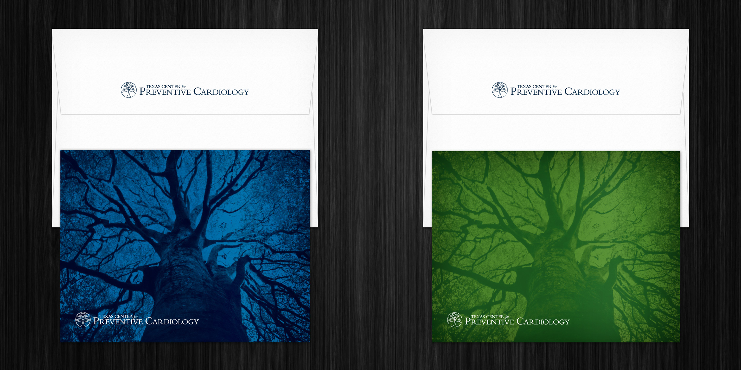
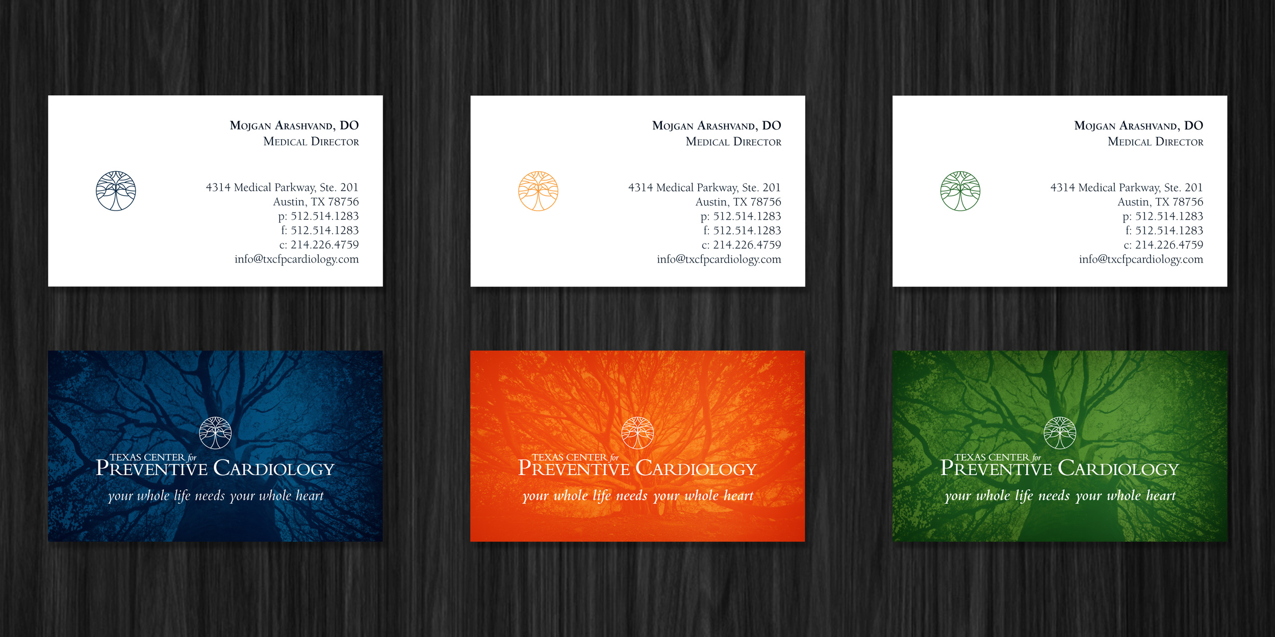
To visually describe the complex interplay of these ideas, the tree of life — an ancient symbol of wisdom and immortality — is crafted from lines that recall branches of the human circulatory system and the veins of a leaf. Wrapped in a circle (symbolizing the whole person and a holistic approach, which is also referenced in the campaign) and mirrored horizontally (referencing the sagittal plane) the branches in the logo assert the link between circulation and life itself. The brand includes bright, living colors of blue, green and yellow rather than the red so commonly associated with the heart.
Wallpapers were created from the symbol, along with photos of Austin's 500-year-old treaty oak — a symbol of longevity and community. Rendered in shades of a single color, the tree closely resembles a scan of the some portion of the human body, the circulatory system clearly visible. This is the area where disease begins, and the focus of cardiac preventive medicine.